Project Overview
The Context
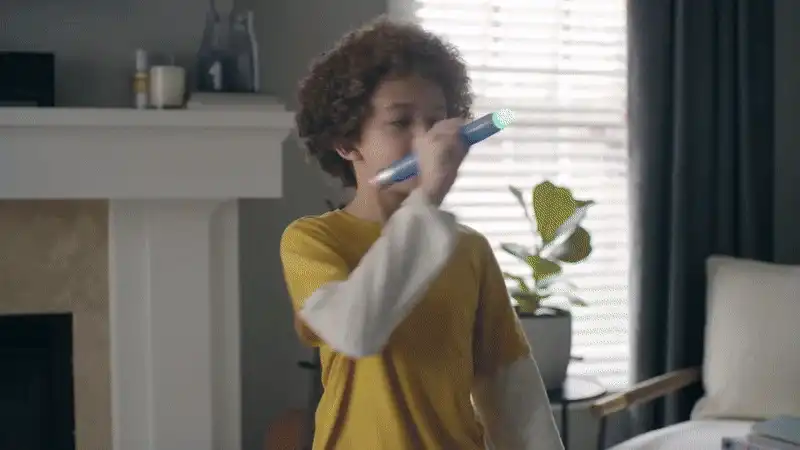
Pictionary Air (”Pic Air”) is a modern twist on the classic drawing game, where scribbles evolved from traditional paper pads into the living room air. Enabled by a special light-pen, machine-vision, and app, Pic Air was an award-winning breakthrough in game design. Despite the successes, the product had known shortcomings and retailers sought a product refresh to justify continued shelf space.
The Problem
Pic Air 1 had low replayability, limited controls, and static content — retail momentum was suffering.
The Solution
A new, multi-device experience: 2 Phones + 1 Bluetooth Pen + Digital clue cards
The Constraint
There can only be one shared app between Pic Air 1 & 2
My Role
UX/UI Designer — led process through A/B testing, systems design, prototyping, and developer handoff.
What's wrong with Pictionary Air?
Limited Player Control: The drawer could not erase drawings or manage scoring, relying entirely on others to control the game flow.

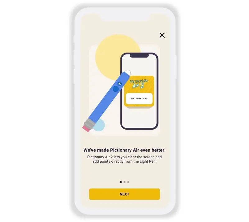
Introducing Pictionary Air 2

Design Challenges
Adding the Bluetooth pen and digital clue cards introduced new complexity with multi-device configurations and varying gameplay options—all of which needed to work intuitively within a single app. The challenge was balancing duality and singularity in the experience, ensuring it felt seamless regardless of which version of the game a user had.
Working closely with engineering, product, and marketing, I focused on three core design challenges:We addressed three key design problems:
🔗 Simplifying multi-device setup for fast, frustration-free onboarding
🃏 Shaping the digital clue card experience to boost value and monetization
🏠 Redesigning the home screen to accelerate game start for all users
1. Setting Up the Game
Onboarding Pictionary Air 1 & 2 Players Together
The onboarding experience needed to address multiple goals: guide users through connecting their Bluetooth pen, introduce new digital clue card features, and reassure Pictionary Air 1 users that their original game remains fully supported.
A key part of the solution was the pen selection screen, which tailors the onboarding flow based on the user’s device and remembers their pen type for future sessions—while leaving room for a seamless upgrade path from Pictionary Air 1 to 2.

Before
Each game stood alone—players selected their game and played with printed clue cards, with no need for shared features or cross-game continuity.
After
The updated onboarding flow sets context for all users. The pen selection screen then tailors the rest of the flow: Pic Air 2 players continue through pen setup, while Pic Air 1 users skip ahead to the home screen. This ensures each user only sees what’s relevant, while keeping the upgrade path open.
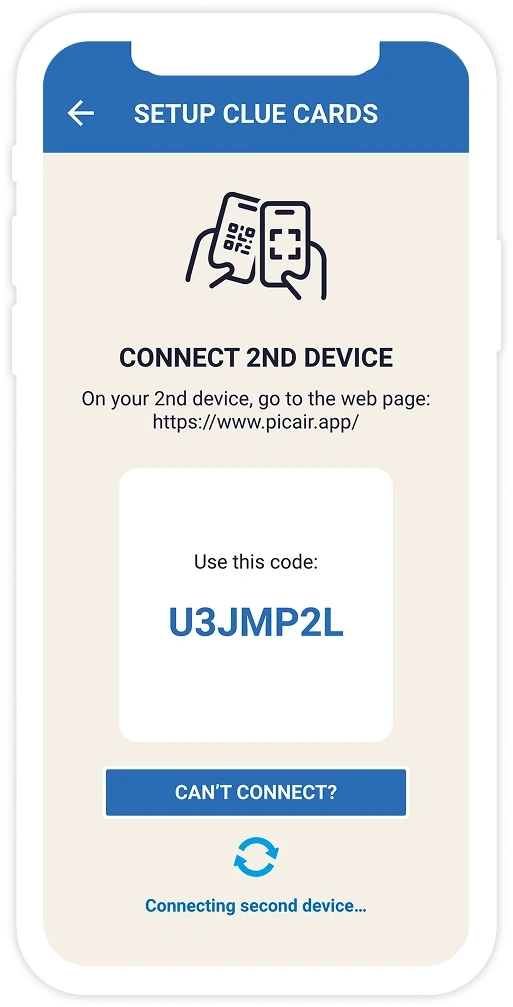
Optimizing Setup Across Three Connected Devices
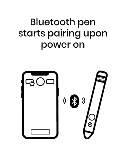
To streamline the multi-device setup, the team and I designed a flow prioritizing speed and simplicity:
The pen automatically pairs via Bluetooth when powered on
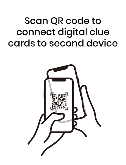
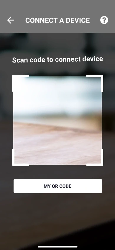
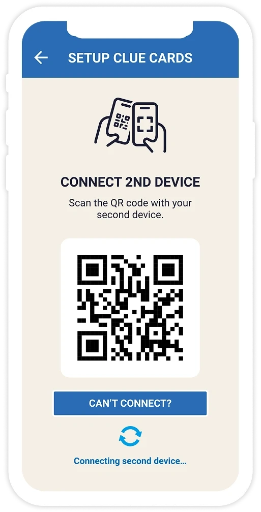
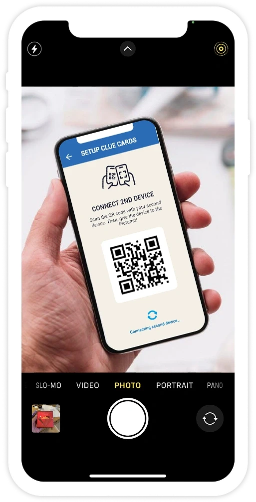
A QR code enables quick syncing between devices, with a unique access code as fallback
The second device connects without app installation or sign-in, lowering the barrier to entry
Concept 1
Connect by access code
Concept 2
Connect by QR code
Concept 3
Connect by QR code & choose device role

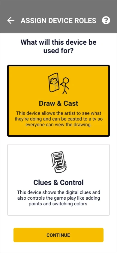
Earlier concepts explored single-method setups and assigning device roles, which required both devices to install the app. These created closed loops and added complexity with little value.
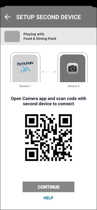
Final Design
Primary method: Connect by QR code
Final Design
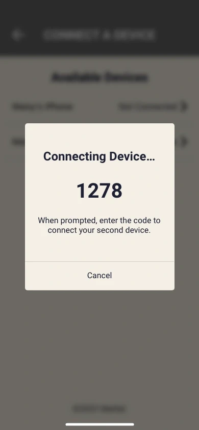
Secondary method: Connect by access code
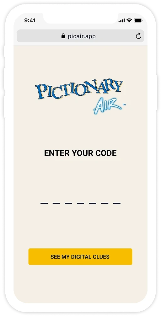
The final design prioritized simplicity by enabling the second device to connect via a browser, lowering barriers and accelerating onboarding. The fallback code-based connection improved error recovery, although in hindsight, instructional content could benefit from clearer wording.
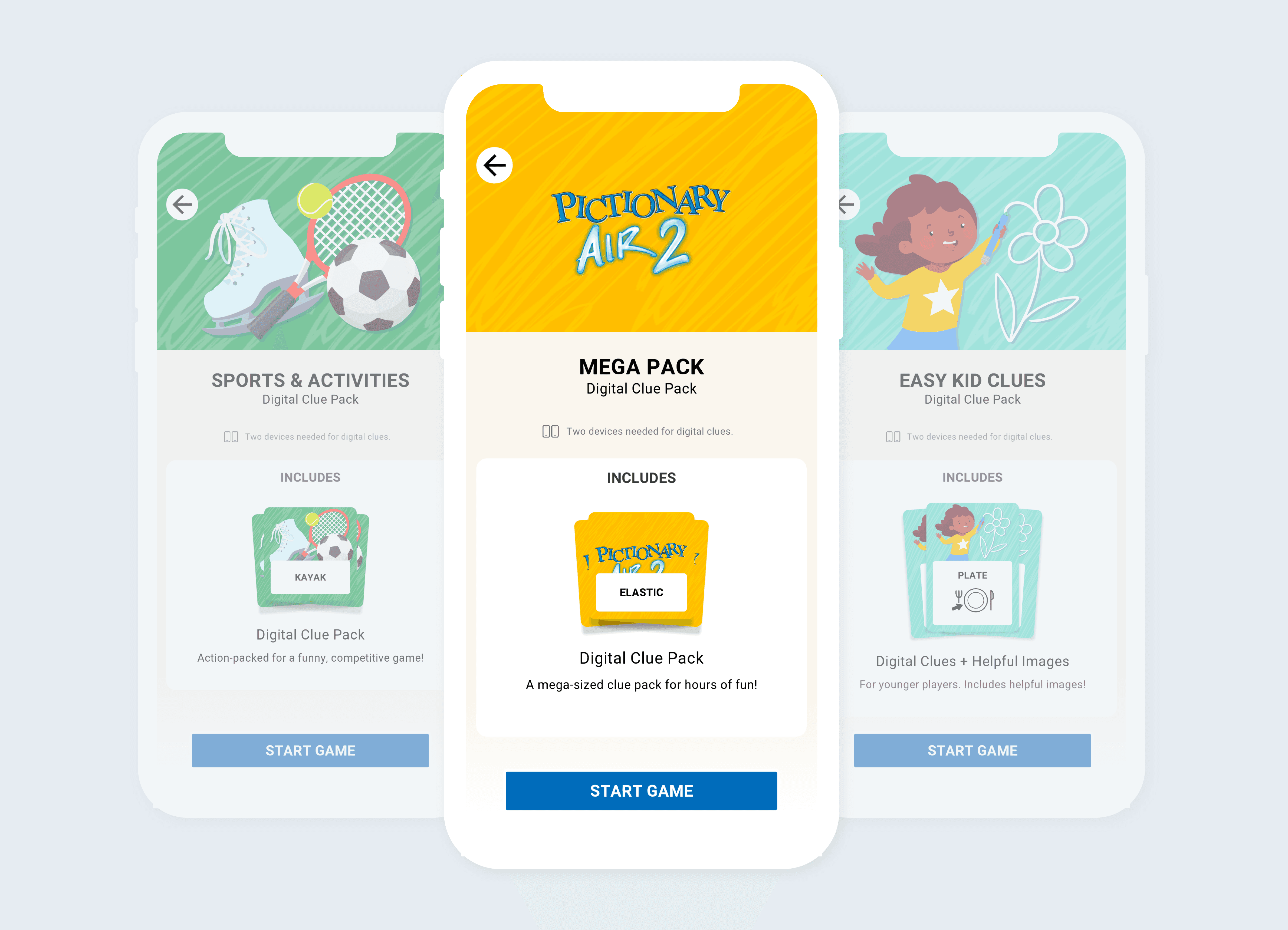
2. Introducing Digital Clue Cards: Unlocking vs Immediate Access
Does Unlocking Clue Cards Make Them More Valuable?
The marketing team raised concerns about the perceived value of digital clue cards, prompting me to prototype unlocking experiences to assess feasibility and impact. I flagged that the added step delayed game start, and engineering raised concerns about the complexity of storing unlocked content. Early testing also revealed that 83% of users already perceived high value in the digital cards—making the unlock step unnecessary.


Final Approach: Immediate Access to Digital Clue Cards
We granted instant access to five digital clue cards packs.
This change allowed all users to explore freely, encouraging organic discovery and future purchases.
By letting gameplay demonstrate value, we prioritized user enjoyment and a seamless experience.
3. Enabling a Quick and Intuitive Game Start for All Players
Though Pictionary Air 1 and 2 players share the same app, their gameplay options differ:
Pictionary Air 2 players can only play using digital clue cards
Pictionary Air 1 players can use digital or physical clue cards
The home screen needed to support both groups, provide a clear path to gameplay, and highlight new digital features without confusion
A/B Testing: Which Design Facilitated Faster Game Start?
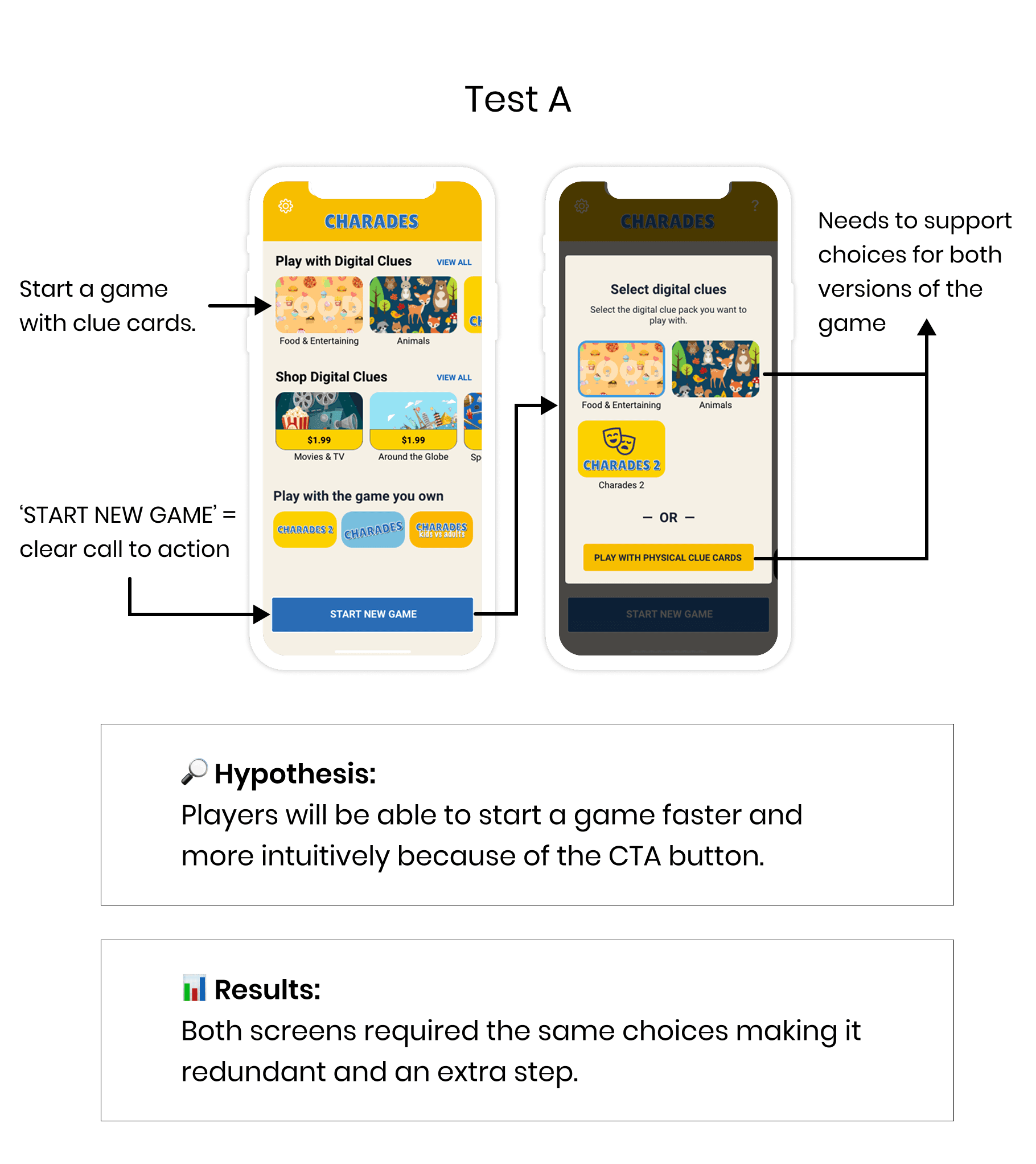
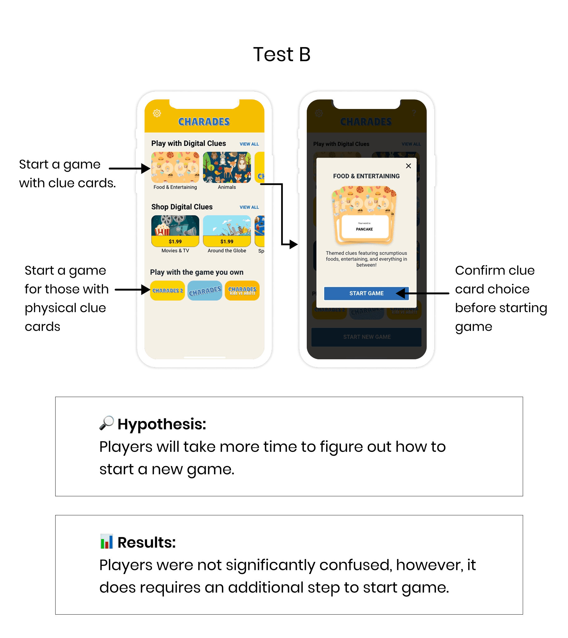
Key Insights: Streamline the User Flow
Neither design A nor B demonstrated a clear advantage in performance. However, qualitative feedback revealed a critical issue: both designs involved extra steps to confirm or initiate a game, leading to user friction and confusion.
Final Solution: Select, connect, and play

Adding a 'Play' button directly to the clue packs reduced the steps to start a game by 25%, taking users straight into setup and making gameplay faster and more intuitive.

Reflection
This project had LAYERS….and pushed me to weigh trade-offs across disciplines to ensuring each part of the connected play system worked in sync.
I enjoyed bridging my background in toy and product design to navigate those complexities, considering everything from physical hardware to real-time interactions to make the experience feel intuitive and fun.